Wall Art for Dark Walls: Creating Contrast Without Losing Atmosphere
A practical guide to luminosity, edge contrast and evening light for rooms painted navy, forest, oxblood or charcoal.

Dark walls change the way art is read. They make pale passages appear brighter, deepen saturated color and can dissolve the outer edge of a shadowed picture until the image seems to emerge from the room itself. The goal is not always maximum contrast. It is legibility with atmosphere: enough separation for the work to hold its form, enough tonal continuity for it to belong.
This guide begins with the wall in real light. It explains how to compare value, temperature and edge clarity; how to avoid a pale canvas that feels pasted onto a dark surface; and how picture lights, lamps and daylight change the result. Four House of Sun Editions works offer distinct approaches—from a blush bouquet to painterly yellow and blue.
Begin in Grayscale
Color names can mislead. A pale green may be lighter than a warm ivory; a saturated blue may hold more luminosity than a dusty rose. Squint at the artwork or view a small grayscale image. Notice the largest light mass, the deepest dark and whether the perimeter remains distinct from the wall.
On charcoal, a work with a pale ground creates immediate graphic clarity. On deep green, warm cream, blush and yellow often feel luminous. Against navy, ochre and rose provide temperature contrast while cooler passages retain continuity. The best choice need not be the brightest. It needs an internal structure that remains readable at the viewing distance.
Shop This Canvas Print →“Darkness gives color somewhere to arrive.”House of Sun Editions
Contrast or Tonal Continuity
High contrast makes the artwork read quickly from a doorway. It suits halls, dining rooms and walls that need a clear focal point. Tonal continuity creates a slower encounter: dark foliage against forest paint, or a shadowed figure against oxblood, can feel enveloping rather than graphic.
Neither approach is automatically more sophisticated. The mistake is accidental disappearance. If the perimeter nearly merges with the wall, make sure a pale interior passage, clear silhouette or pool of light still gives the eye a route through the picture. If the canvas is very pale, connect it to the room through one repeated warm material—linen, aged brass, pale wood—so it feels held rather than pasted on.
Navy, Forest, Oxblood and Charcoal Behave Differently
Two walls that look equally dark can ask for different art. Navy often carries a cool or inky undertone; forest green may lean blue, olive or brown; oxblood is warmed by red; charcoal can appear blue, violet or almost black as the light changes. Place a white sheet of paper beside the paint in daylight. The comparison makes the undertone easier to see and helps explain why an artwork that looked balanced online becomes unexpectedly cold or yellow in the room.
You do not have to match that undertone. A warm landscape on a cool navy wall can be compelling because the temperature difference creates energy. What matters is repetition: let one smaller color in the artwork answer something else in the room—a walnut table, an aged brass lamp, a rust textile or a pale linen shade. That second connection makes contrast feel intentional rather than accidental.
Paint finish affects the result too. A matte wall absorbs light and can make a canvas appear more luminous. Satin or lacquer reflects windows and lamps, introducing moving highlights around the art. Test the actual sample vertically, because a color and sheen seen flat on a table will not behave the same way on the wall.
Art That Keeps Its Presence on a Dark Wall
Blush Bouquet I
Pale petals and warm ground can become a pool of light against forest, burgundy or charcoal.
Shop This Canvas Print →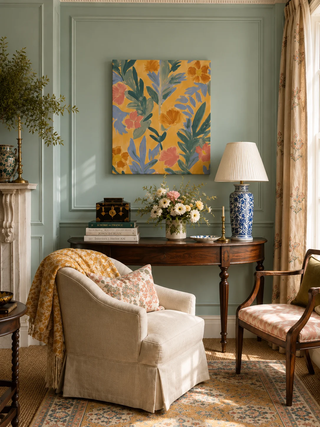
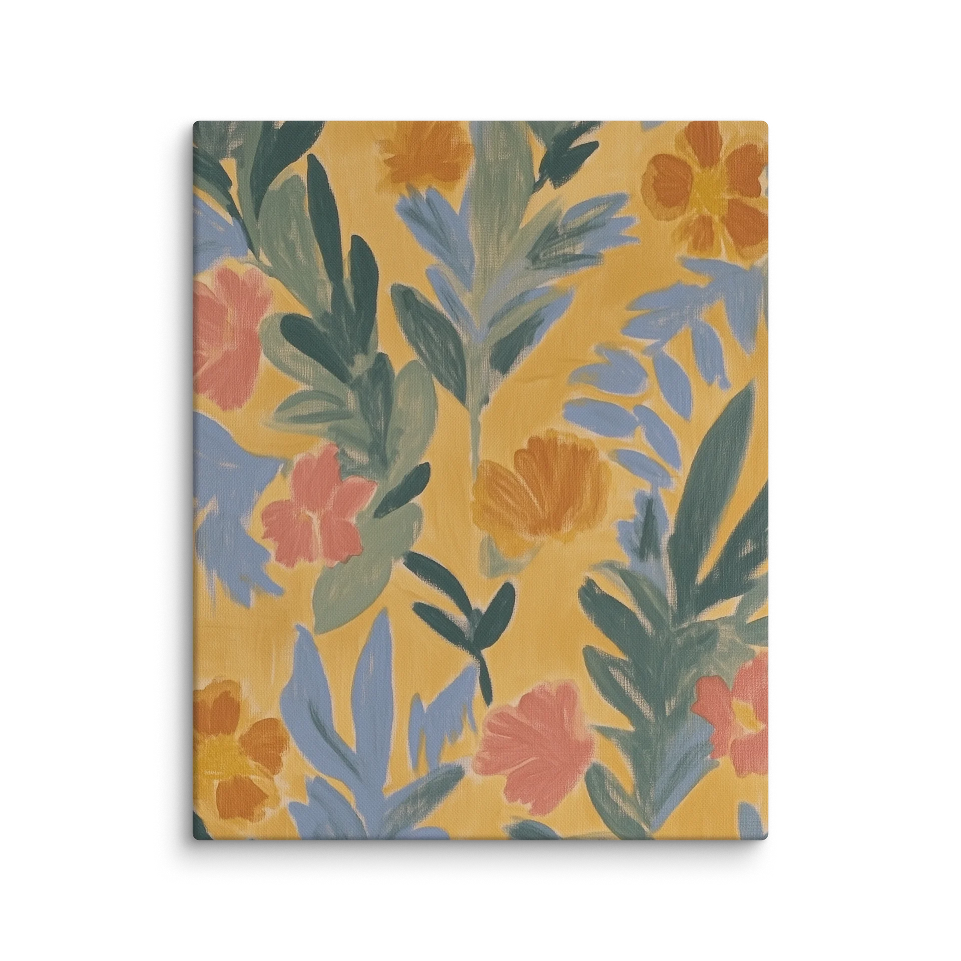
Golden Bloom I
Yellow carries forward in low light, while blue keeps the work connected to a navy or charcoal wall.
Shop This Canvas Print →
Golden Bloom II
Warm painterly movement works as controlled contrast without turning the wall into a sharp black-and-white scheme.
Shop This Canvas Print →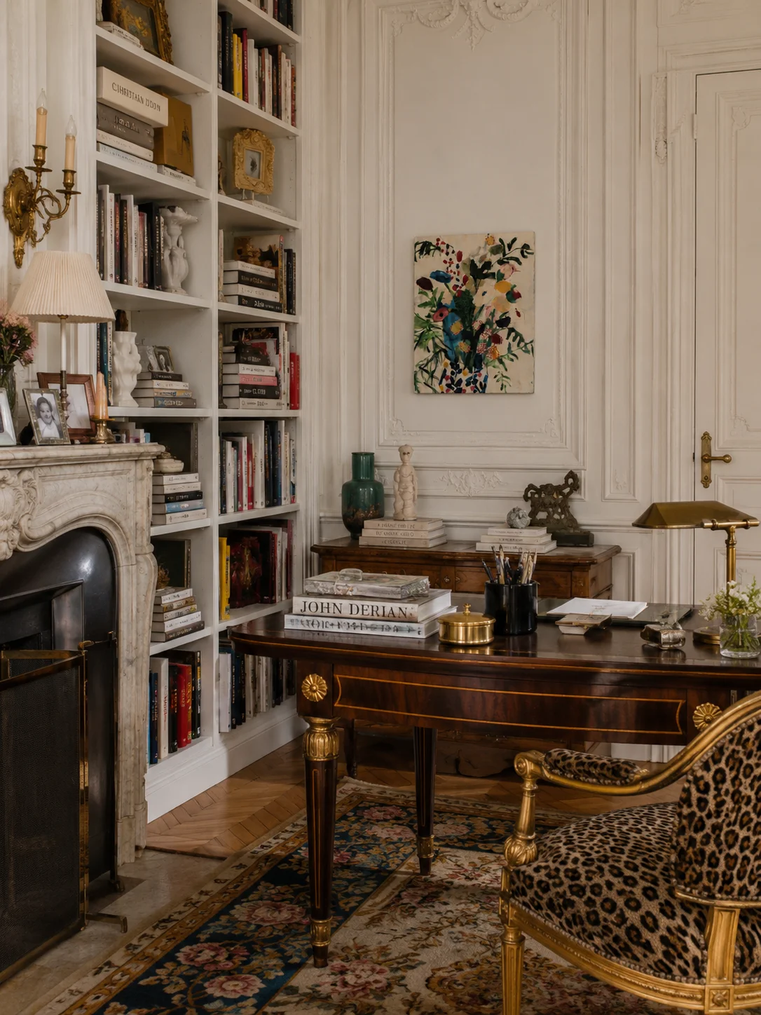
Botanical Study I
Foliage can echo a green wall while the lighter botanical forms preserve definition and depth.
Shop This Canvas Print →“The most beautiful contrast is rarely white against black; it is light finding its way through color.”House of Sun Editions
Choose Whether the Edge Should Separate or Dissolve
A pale mount, gilt frame or light-painted moulding creates a clear interval between artwork and dark wall. This is useful when the image itself has a dark perimeter or when the room needs a small source of brightness. A black or dark-wood frame can do the opposite: it lets the boundary recede while a lighter passage inside the picture becomes the focus. A gallery-wrapped canvas sits between these effects, using physical depth and a cast shadow instead of an added band of color.
Judge the frame in relation to every other edge nearby. If the room already contains bright window trim, pale shelves and brass hardware, another light outline may feel lively or overly busy. If curtains and upholstery are tonal, a restrained frame can preserve the atmosphere. The aim is not to match every finish; it is to establish a hierarchy so the eye knows where to rest.
For grouped art, consistency can come from spacing or a repeated material rather than identical frames. Dark walls are especially forgiving of mixed antique woods and subdued gilt because the background unifies the collection. Keep the intervals deliberate and let at least one work carry enough light to anchor the arrangement.

Light the Artwork, Not the Entire Wall
A dark room often becomes most beautiful after sunset, precisely when poorly placed art can disappear. Use layered light: a picture light, directional ceiling spot or nearby lamp that grazes the surface without producing a hot center. Check the work from the usual seat, not only while standing directly in front of it.
Warm bulbs enrich ochre, blush, cream and wood; cooler light can sharpen blue and green but may flatten warm neutrals. Before committing, hold a printed sample or screen image on the wall at several times of day. The aim is not showroom brightness. It is enough light for the composition to remain present while the wall keeps its depth.
Test the Artwork by Day and After Sunset
Dark paint is most changeable at the hours when a room is actually occupied. In daylight, a window may reveal blue or green in the wall and bring out the quieter middle values of a painting. At night, the same wall can become nearly black while lamps warm every pale area in the artwork. Evaluate both conditions. A piece that depends on a faint tonal distinction may disappear after sunset; one with a strong light mass can become the room’s visual hearth.
Use several modest sources rather than one harsh spotlight. A shaded table lamp can light the lower half of the room, while a properly positioned picture light or ceiling source gives the art definition. Check for glare from the main seat and avoid a narrow, intense beam that bleaches the center while leaving the edges dead. Light should reveal the work, not announce the equipment.
Living room, dining room and bedroom
In a living room, relate the picture to the full seating group and test it from across the room. In a dining room, check the lower evening light and the reflections created by candles or pendants. In a bedroom, softer contrast often feels restful; a tonal landscape or botanical work can remain legible through a pale passage rather than a brilliant white ground.
Before ordering, photograph the wall straight on and overlay the listed dimensions, or mark them with tape. Leave enough dark wall around the art for the paint to remain part of the composition. The House of Sun Editions guide to choosing wall art offers a wider framework for scale and placement.
“A dark room should reveal itself slowly, but it should still reveal.”House of Sun Editions
Wall Art for Dark Walls
What color artwork looks best on dark walls?
Pale grounds, warm highlights and clear silhouettes are reliable, but tonal works can also succeed when the composition contains enough internal contrast. Judge value and edge clarity before relying on color names.
Should artwork be lighter than the wall?
Not necessarily. A dark work can create a rich, enveloping effect if a lighter passage or clear structure keeps it legible.
Do I need a light frame?
No. A light or gilt frame can introduce separation, while an unframed canvas can feel quieter. Choose according to the composition and the other edges already present in the room.
How do I light art on a dark wall?
Use focused, low-glare light and test it from the usual viewing position. Avoid direct sunlight and an intense spot that washes out the center.
How much space should surround the canvas?
Leave enough wall visible for the perimeter to read clearly. Above furniture, test the complete relationship with removable tape using the exact listed dimensions.
Sources & product references
Blush Bouquet I · Golden Bloom I · Golden Bloom II · Botanical Study I. Links checked 8 October 2026.